
Loading page
All work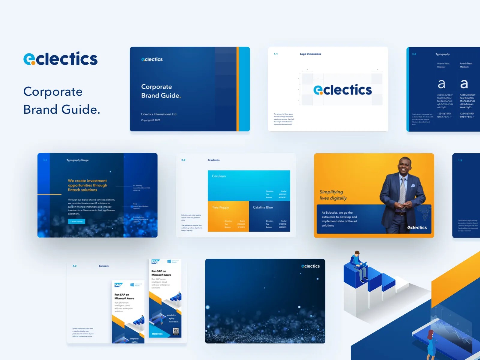
Pick a screen to zoom in · ← → to step through · Esc to reset
14 · Brand system · Earlier work
Corporate brand guide for fintech
This fintech brand guide translates a corporate identity into practical rules for the teams, agencies and partners applying it.
It covers logo construction and clear space, typography, colour, gradients, iconography and illustration, then shows those foundations in photography treatments, banners and merchandise. The emphasis is on making the system usable beyond the original design files: specifications sit alongside worked examples so the identity has a consistent visual language across different materials.
The problem
A growing Pan-African fintech needed its identity applied the same way by everyone: internal teams, agencies and partners.
Rules, not just assets
The guide doesn't just show the logo. It sets clear-space rules relative to the mark, names each gradient with its direction and stop values, and pairs type specimens with real usage examples.
Banners and photography treatments show the rules applied, so the guide teaches by example as well as by specification.